Introduction
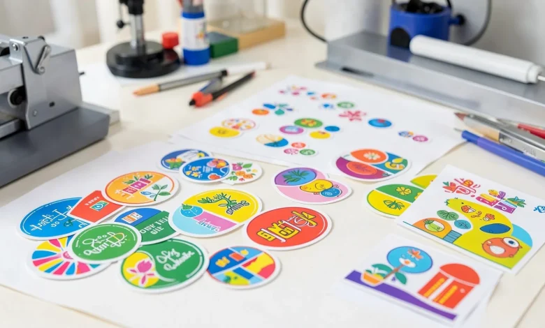
Custom stickers are widely used for branding, packaging, events, personal projects, and product labeling. What once required specialized software can now be done with structured, template-based design tools that simplify layout and export settings.
For beginners, the main challenge is not creativity. It is understanding sizing, resolution, margins, and file preparation for print. A modern Custom Stickers Editor removes much of that friction by guiding users through structured templates and export presets.
One accessible starting point is online sticker design from Adobe Express, which provides preset sizes and printable layouts suited for common sticker formats. While this guide references that workflow early on, the focus is on practical design decisions that apply regardless of platform.
The steps below emphasize clarity, layout discipline, and print-readiness rather than artistic complexity.
Step-by-Step Guide for Using a Custom Stickers Editor
Step 1: Clarify the Sticker’s Purpose and Size
Goal
Define what the sticker will be used for and select an appropriate size and shape before designing.
How to do it
- Identify the use case (product label, laptop decal, packaging insert, promotional giveaway).
- Choose a shape (circle, square, die-cut, rectangle).
- Select a realistic size (2×2 inches for small decals, 3×3 inches for branding stickers).
- Open a template in your Custom Stickers Editor and select a matching preset.
- Confirm whether printing will be done at home or through a professional printer.
What to watch for
- Designing without fixed dimensions can distort artwork later.
- Small stickers require larger text and simplified graphics.
- Die-cut shapes require clean background handling.
Tool notes
Size planning can be mapped out in project tools such as Trello for tracking different sticker variations and dimensions across a campaign.
Step 2: Set Up the Canvas for Print Accuracy
Goal
Prepare the file with the correct technical settings before designing.
How to do it
- Set resolution to 300 DPI.
- Switch to CMYK color mode if printing professionally.
- Add bleed (usually 0.125 inches) if required.
- Keep all critical elements inside a safe margin.
- Preview at 100% zoom to simulate print scale.
What to watch for
- Low DPI causes blurry output.
- RGB colors may shift in CMYK printing.
- Text too close to the edge can be trimmed.
Tool notes
For checking print specifications or confirming file requirements with your printer, file validation tools like Adobe Acrobat Reader can be used to inspect exported PDFs before submission.
Step 3: Build a Simple, Balanced Layout
Goal
Create a clear visual hierarchy that is easy to read at a glance.
How to do it
- Choose one focal message.
- Use no more than two font styles.
- Center-align or grid-align elements consistently.
- Ensure high contrast between text and background.
- Keep spacing generous.
What to watch for
- Overcrowded layouts reduce readability.
- Thin fonts disappear at small scale.
- Decorative fonts can become illegible when resized.
Tool notes
If you need guidance on basic typography structure, educational platforms like Skillshare offer short lessons on layout fundamentals that can improve beginner designs.
Step 4: Use Clean Graphics and Vector Elements
Goal
Ensure artwork prints sharply at any size.
How to do it
- Prefer vector files (SVG) over raster images.
- Avoid screenshots or compressed web images.
- Simplify detailed illustrations.
- Remove unnecessary background elements.
- Confirm transparency if creating die-cut stickers.
What to watch for
- Raster images pixelate when resized.
- Complex gradients may band in print.
- Transparent backgrounds must remain intact during export.
Tool notes
If creating original illustrations, vector-focused tools such as Inkscape can help produce scalable graphics that remain sharp when printed.
Step 5: Adjust Colors for Print Reliability
Goal
Prevent color shifts and maintain strong visual clarity.
How to do it
- Increase contrast between foreground and background.
- Avoid very light gray text.
- Test darker shades for saturation.
- Print a small sample before ordering in bulk.
- Limit heavy gradient use.
What to watch for
- Bright neon colors may not reproduce accurately.
- Dark tones may print darker than on-screen previews.
- Subtle shading can flatten in print.
Tool notes
Color reference systems such as Pantone Connect can help preview and match print colors more reliably when precision is important.
Step 6: Export the File in the Correct Format
Goal
Produce a clean, print-ready file.
How to do it
- Export as high-resolution PDF (Print) or PNG with transparency.
- Confirm 300 DPI resolution.
- Include bleed settings if required.
- Review the exported file at full scale.
- Double-check spelling and alignment.
What to watch for
- Compressed files lose detail.
- Export scaling errors can resize artwork incorrectly.
- Transparent layers may flatten unintentionally.
Tool notes
File compression and preview checks can be handled through utilities like Smallpdf to verify final file quality before submission.
Step 7: Manage Production and Distribution
Goal
Keep sticker production organized once design is complete.
How to do it
- Confirm quantity requirements.
- Record print specifications.
- Track deadlines for delivery.
- Store source files in a labeled folder structure.
- Document version numbers for reorders.
What to watch for
- Losing original editable files makes revisions difficult.
- Not tracking versions can cause reprint errors.
- Over-ordering without testing demand can increase costs.
Tool notes
For coordinating print timelines and collaboration, project management tools like Asana can help track deadlines and version approvals.
Common Workflow Variations
1. Personal Art Stickers
Focus on bold visuals and minimal text. Transparency and die-cut shape are more important than detailed typography.
2. Small-Business Branding Stickers
Prioritize logo clarity and brand color consistency. Ensure safe margins protect the brand mark.
3. Event Giveaway Stickers
Simplify messaging. Stickers should be readable from a distance and visually distinct.
4. Product Packaging Labels
Accuracy matters most. Confirm sizing aligns with packaging dimensions and regulatory requirements.
Checklists
Before You Start Checklist
- Defined sticker purpose
- Chosen correct size and shape
- Confirmed print method (home vs. professional)
- Collected high-resolution assets
- Selected readable fonts
- Verified brand colors
- Reviewed printer specifications
- Planned timeline for production
Pre-Export / Pre-Order Checklist
- 300 DPI resolution confirmed
- CMYK color mode (if required)
- Bleed added (if required)
- Text inside safe margins
- No pixelated images
- Spelling checked
- Transparency verified
- File exported in correct format
- Final preview reviewed at 100%
Common Issues and Fixes
Blurry or pixelated print
Use vector graphics or high-resolution images at 300 DPI.
Text too close to the edge
Adjust layout and re-export with proper safe margins.
Colors look different in print
Switch to CMYK mode and test a sample print.
Sticker trimmed unevenly
Add bleed and extend background elements beyond trim line.
File rejected by printer
Review export settings and confirm required format.
How To Use Custom Stickers Editor: FAQs
Do I need professional design skills to create stickers?
No. Most Custom Stickers Editors include structured templates and preset dimensions that guide beginners through layout and export.
What file type is best for professional printing?
A print-ready PDF with 300 DPI resolution is generally preferred. PNG with transparency is suitable for die-cut stickers.
Is it better to start with a template or a blank canvas?
Templates are useful for beginners because they include sizing, bleed, and layout guidance.
How large should text be on small stickers?
Keep text bold and legible. Very small stickers require simplified typography.
Can I reuse one design across multiple sizes?
Yes, but ensure the design scales properly and remains readable at smaller dimensions.